
Having a great product and marketing it well is one thing, but what if your website is clunky and hard to use? Your customers will find a better experience with one of your competitors and you’ll lose them forever. The key to attracting and keeping customers on your eCommerce website is to make the ux design, accessible and easy to use, plain and simple.
If you do build a great experience, customers tell each other about that. Word of mouth is very powerful – CEO of Amazon Jeff Bezos
To fully understand what this means, lets break it down to the basics of what makes a great user experience for your customers in regards to your eCommerce website.
Quality Products they will promote.
This goes without saying, first and foremost, your products should be good. No one is going become a return customer or promote your products if they aren’t good. So avoid flogging a dead horse! If your products are good then promote customers to leave or provide reviews. You can offer incentives for confirmed purchasers to leave reviews such as discount codes for their next purchase. Reviews are one of the first things people will look for before adding a product to the basket so making your happy customers sing your praises will provide an unsure customer with the confidence to make that purchase.
Quality Presentation they can trust.
One big mistake alot of people make is having poor product imagery or none at all. Would you be quick to hit that checkout button if the product image was blurry and had poor lighting?. Of the 3 products below, which would you be most likely to purchase based on the product image displayed? Which do you think will have the most sales conversions?

Provide a quality user experience they would recommend.
Making the payment process flow and require as little input as possible will ensure it’s quick and easy for people to buy your products, so don’t slow down the process bombarding them with additional CTA’s, countless form input fields and distractions such as email newsletter sign ups or up-selling tactics. Consumers are wiser than ever today and much prefer an unobtrusive and easy checkout process above all else.
Ask for less and they’ll buy more!
Let look at a poor example of a checkout and see whats bad in it.
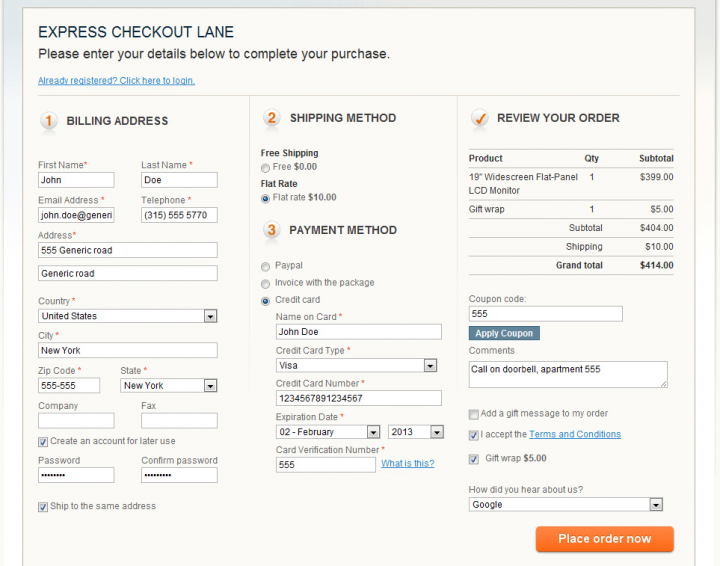
Some might think to avoid having 3-4 steps in a checkout by just lumping it all into one page. This can easily backfire as evident in the above image. Lumping all the required information together can result in a mess that on first impressions will turn off most users as the amount of information required can be daunting.
Lets look at an example of a good checkout and see what they do right?
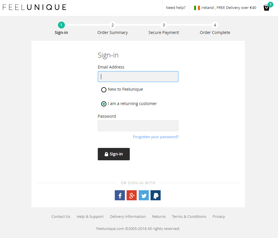
OK, so there’s a lot of good things happening in the above checkout page.
- It’s clean and easy to understand.
- I can easily see I have 1 item in my basket.
- I can easily see I have free delivery with orders over €40. Up-selling without any hurdles or slowdown. Nice.
- I can sign in to my account in any number of ways, or sign up.
- The steps involved are clearly broken down into bite sized, digestible chunks. 4 simple steps. Sign In, Order Summary, Payment & Order Complete. What more would I need. Nice and simple.
The user experience is always adapting as the technologies evolve and users become more accustomed to a more fluid process. It can be a challenge to stay ahead of the curve but there’s no excuse for not tackling the simple things that are obvious. Quality presentation shouldn’t be out of anyone’s reach. Invest in a good photographer if you need too. The design and development should be able to design and create a stream lined checkout and avoid over-cluttering the design with distractions, allowing the user to make they’re way, unobstructed through to order completion.